The Home screen
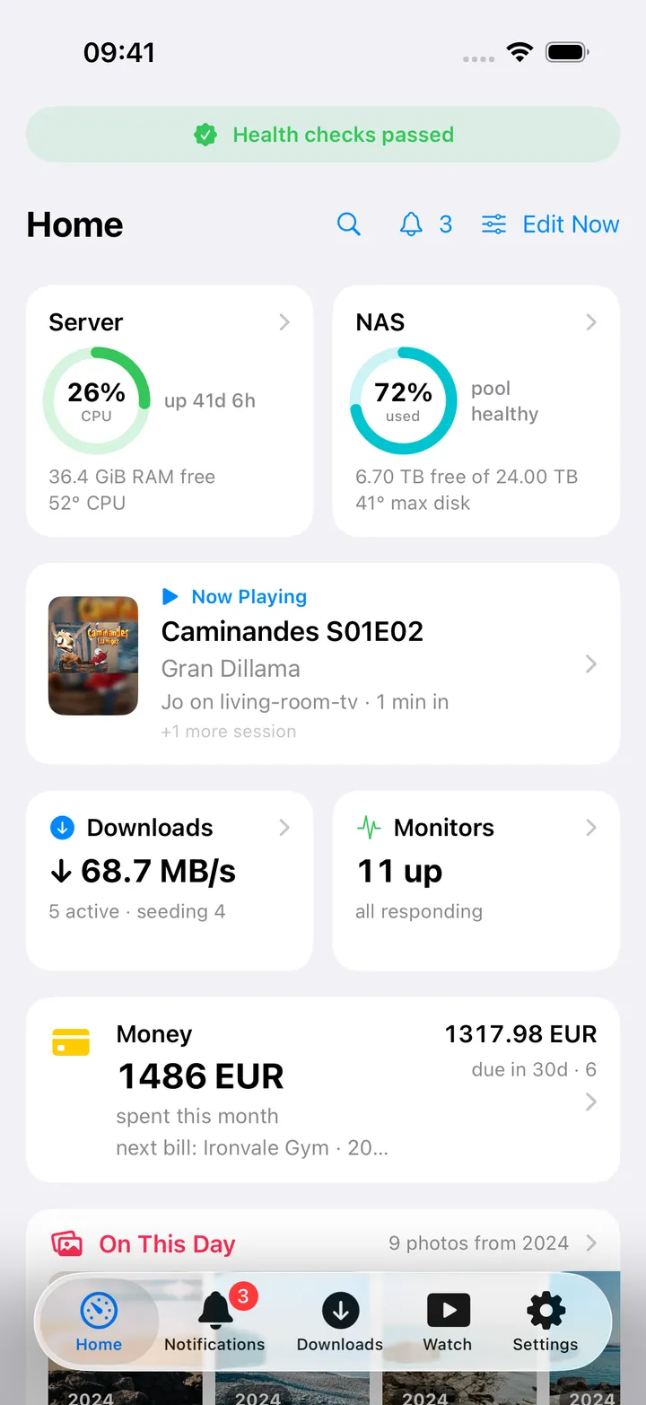
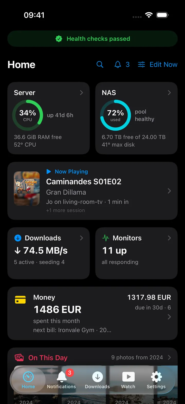
The dashboard: a pinned header banner, issue chips, and a grid of half- and full-width cards that each load independently.
iPhoneOn this page
Home is the first tab and the app’s dashboard. It is a scrolling grid of cards, one per configured service, with an optional status banner pinned above it.
Anatomy
- Pinned header: a full-width capsule summarising one thing you care about (see below).
- Getting started: on a new setup, a card with the next few steps until they are done or you press Hide.
- Top row: the title Home, a magnifying glass that opens search, a bell showing the app badge total, and Edit Now.
- Issue chips: a strip of red and orange capsules, rendered only when something is actually wrong.
- Cards: half-width tiles pair up two per row; full-width cards stand alone and show more detail.
- Footer: up to two inline errors, then Updated 14:32 from the most recent stats snapshot.
Every row loads independently
Each card runs its own request and settles the moment that request returns. A slow Jellyfin never holds up your monitors. While a card reloads it keeps the value it already had, and if the request fails the old value stays put with a small red error line underneath it, the list never blanks.
Partially failed server stats are “filled” from the previous snapshot, so a blip does not replace your numbers with dashes. Cards with no value yet show a skeleton bar, and tiles reserve two caption lines so heights never jump.
A service that keeps failing is skipped for a while (60 seconds after the first miss, then 120, then 240) so its timeouts do not slow every refresh. Its last value and error stay on the card, and a pull-to-refresh, a return to the app or a settings change asks it again at once.
The pinned header
Settings → App → Home layout → Pinned header picks one banner, filtered to services you actually have. The default is System status, which reports both what is wrong and whether the checks behind it are current:
| Banner | Means |
|---|---|
| “Health checks passed” (green) | Every configured health source answered recently and nothing is wrong. |
| “2 issues” (red) | Something is wrong. “· checks incomplete” is added while a source is not current. |
| “Checking your homelab…” | The first checks are still running. |
| “Health checks are stale” (orange) | A source’s last check failed, or its last good answer is older than two normal refreshes. |
| “Health checks unavailable” (orange) | A source’s check failed and it has not answered once since your settings last changed. |
| “No health checks configured” | None of the health sources below is set up. |
The health sources are Server & NAS, Monitors, AdGuard, Disk health and Backups, whichever you have. Tapping the banner opens Health checks: the issues, then each source as Up to date, Stale, Unavailable or Checking… with its Last successful check. A last known reading is not proof that a service is healthy now, so a cached number never counts as a passed check.
Other choices include:
| Header | Example |
|---|---|
| Server CPU, temperature & RAM | CPU 24% · 48° · load 0.52 · 12.3 GiB RAM free |
| NAS storage | tank 62% used · 4.20 TB free |
| Now playing | alice watching The Expanse · +1 |
| AdGuard | Protecting · 1,240 blocked (10.0%) |
| Speedtest | ↓ 300 ↑ 95 Mbps · 8 ms |
| This month’s spend | Spent 650 BAM this month · next: Netflix |
| Latest alert | Backup completed · 5 min ago · 3 new |
| Tasks due today | 2 overdue · 1 due today |
| Next release | Dune: Part Two · Friday |
Choose None to hide the banner entirely.
Issue chips
The chips appear only when there is something to report, and each one is a link to the screen that can fix it:
| Chip | Colour | Goes to |
|---|---|---|
3 monitors down |
red | Monitors |
Pool tank degraded |
red | NAS |
SMART: 2 warnings |
red | Disks |
Backups need attention |
orange | Backups |
AdGuard paused |
orange | AdGuard |
CPU 92% |
orange | Server |
CPU 84° |
orange | Server |
Cards
Cards come in two sizes. Half cards are stat tiles: icon, title, a big value and up to two caption lines. Full cards are wider and add a details column of up to four lines. Server and NAS use a hero gauge, a 60-point progress ring with the headline value inside it.
A few cards are always full width: Issue chips, Open in Browser and Web search. Jellyfin, Photos and Money default to full width; everything else defaults to half.
Cards are only available when their service is configured. Issue chips additionally needs at least one issue, Photos needs something to show (memories for today, or recent photos), Open in Browser needs at least one link, and Notes needs the Notes app on your Nextcloud (see Nextcloud Notes).
What a card can show
Most cards offer more than one headline under Show on this card:
- Server: CPU usage (default), RAM usage, CPU temperature.
- NAS: Storage used (default), Free storage.
- Downloads: Overview (default), Active transfers, Download speed, Upload speed.
- AdGuard: Blocked percentage (default), Blocked requests, Total requests.
- Speedtest: Download speed (default), Upload speed, Latency.
- Money: This month’s spending (default), Total account balance, Upcoming bills.
- Photos: On This Day (default), Recent photos.
- Tasks: Overview, All open tasks, Overdue tasks.
- Alerts: Unread count (default), Latest message.
Show supporting details turns the caption and detail lines off for a quieter card. On the Money card, Hide
values on Home shows •••• instead of the amounts, and search leaves transaction amounts out; the full values
stay visible inside Money.
Opening a card
Tapping a card opens its screen on Home, with the Back button to return, even when that screen also has a tab. The Photos card opens Photos on what it shows: today’s memories, or your recent photos.
Long-press a card for Edit dashboard, Edit card and Hide card. With Nextcloud Notes available there is also Notes about this: the notes that mention that card, and Write a note about this, which starts a note with a link back to it. See Nextcloud Notes.
Editing the layout
- Tap Edit Now (or long-press any card → Edit dashboard).
- Cards start to wobble. Hold and drag one to move it; use the corner arrows to switch between half and full width.
- The − badge hides a card. The ellipsis menu offers Move earlier / Move later.
- Add cards opens the library: Available cards you can toggle on, and greyed Unavailable services.
- Select Done, or just switch tabs.
Hidden and unconfigured cards keep their saved position, so re-adding a card puts it back where it was with its settings intact. Settings → App → Home layout has the same controls as a list, plus Restore default layout.
Empty, paused and offline states
With nothing configured, Home is the welcome screen: Look around first, Connect a service and Bring your configuration. See Install.
On the free plan with more than three services connected and none chosen yet, Home says Choose your three services (nothing is lost, the others stay saved and paused) with Choose services and See Pro.
When the device drops off the network, Home is replaced by Available offline: one row per service with downloaded content, each showing how many files and how much space. The banner above reads “Offline · Showing content saved on this device”. See Downloads & offline.